
「一图胜千言」
「一张图片的最大价值在于,它迫使我们注意到我们从未期望看到的东西。」 ——John Tukey
三、快速回顾可视化
    import pandas


    as pd


 import matplotlib.pyplot as plt
 from mpl_toolkits.mplot3d import Axes3D
 import matplotlib as mpl
 import numpy as np
 import seaborn as sns
%matplotlib inline
我们将主要使用 matplotlib 和 seaborn 作为我们的可视化框架,但你可以自由选择并尝试任何其它框架。首先进行基本的数据预处理步骤。
   white_wine = pd.read_csv(


    'winequality-white.csv', sep=


    ';')


red_wine = pd.read_csv( 'winequality-red.csv', sep= ';')

 # store wine type as an attribute
red_wine[ 'wine_type'] = 'red'
white_wine[ 'wine_type'] = 'white'

 # bucket wine quality scores into qualitative quality labels
red_wine[ 'quality_label'] = red_wine[ 'quality'].apply( lambda value: 'low'
 if value <= 5 else 'medium'
 if value <= 7 else 'high')
red_wine[ 'quality_label'] = pd.Categorical(red_wine[ 'quality_label'],
 categories=[ 'low', 'medium', 'high'])
white_wine[ 'quality_label'] = white_wine[ 'quality'].apply( lambda value: 'low'
 if value <= 5 else 'medium'
 if value <= 7 else 'high')
white_wine[ 'quality_label'] = pd.Categorical(white_wine[ 'quality_label'],
 categories=[ 'low', 'medium', 'high'])

 # merge red and white wine datasets
wines = pd.concat([red_wine, white_wine])

 # re-shuffle records just to randomize data points
wines = wines.sample(frac= 1, random_state= 42).reset_index(drop= True)
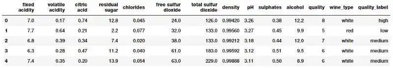
我们通过合并有关红、白葡萄酒样本的数据集来创建单个葡萄酒数据框架。我们还根据葡萄酒样品的质量属性创建一个新的分类变量 quality_label。现在我们来看看数据前几行。
wines.head()

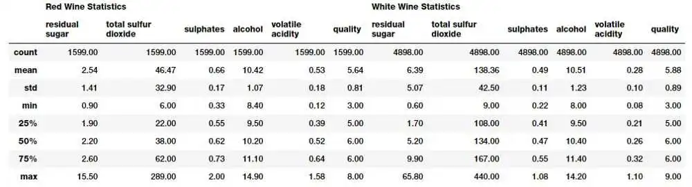
   subset_attributes = [


    'residual sugar',


    'total sulfur dioxide',


    'sulphates',


 'alcohol', 'volatile acidity', 'quality']
rs = round(red_wine[subset_attributes].describe(), 2)
ws = round(white_wine[subset_attributes].describe(), 2)

pd.concat([rs, ws], axis= 1, keys=[ 'Red Wine Statistics', 'White Wine Statistics'])

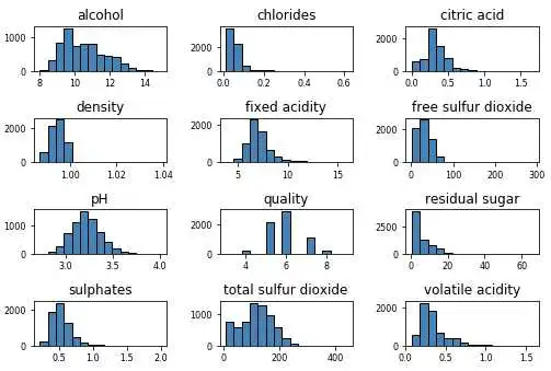
   wines.hist(bins=


    15, color=


    'steelblue', edgecolor=


    'black', linewidth=


    1.0,


 xlabelsize= 8, ylabelsize= 8, grid= False)
plt.tight_layout(rect=( 0, 0, 1.2, 1.2))

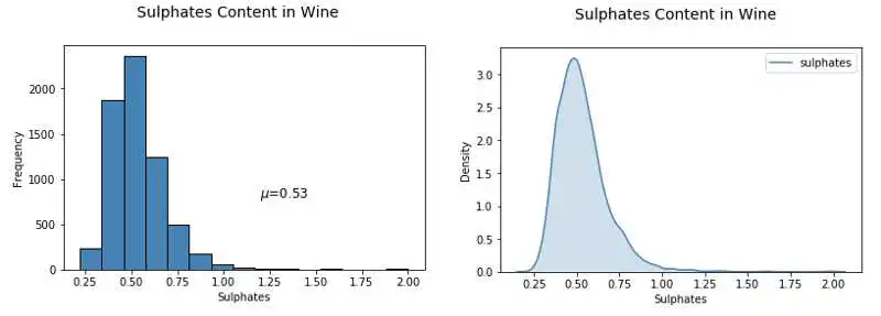
    # Histogram


fig = plt.figure(figsize = ( 6, 4))
title = fig.suptitle( "Sulphates Content in Wine", fontsize= 14)
fig.subplots_adjust(top= 0.85, wspace= 0.3)

ax = fig.add_subplot( 1, 1, 1)
ax.set_xlabel( "Sulphates")
ax.set_ylabel( "Frequency")
ax.text( 1.2, 800, r'$\mu$='+str(round(wines[ 'sulphates'].mean(), 2)),
 fontsize= 12)
freq, bins, patches = ax.hist(wines[ 'sulphates'], color= 'steelblue', bins= 15,
 edgecolor= 'black', linewidth= 1)


 # Density Plot
fig = plt.figure(figsize = ( 6, 4))
title = fig.suptitle( "Sulphates Content in Wine", fontsize= 14)
fig.subplots_adjust(top= 0.85, wspace= 0.3)

ax1 = fig.add_subplot( 1, 1, 1)
ax1.set_xlabel( "Sulphates")
ax1.set_ylabel( "Frequency")
sns.kdeplot(wines[ 'sulphates'], ax=ax1, shade= True, color= 'steelblue')

    # Correlation Matrix Heatmap


f, ax = plt.subplots(figsize=( 10, 6))
corr = wines.corr()
hm = sns.heatmap(round(corr, 2), annot= True, ax=ax, cmap= "coolwarm",fmt= '.2f',
 linewidths= .05)
f.subplots_adjust(top= 0.93)
t= f.suptitle( 'Wine Attributes Correlation Heatmap', fontsize= 14)
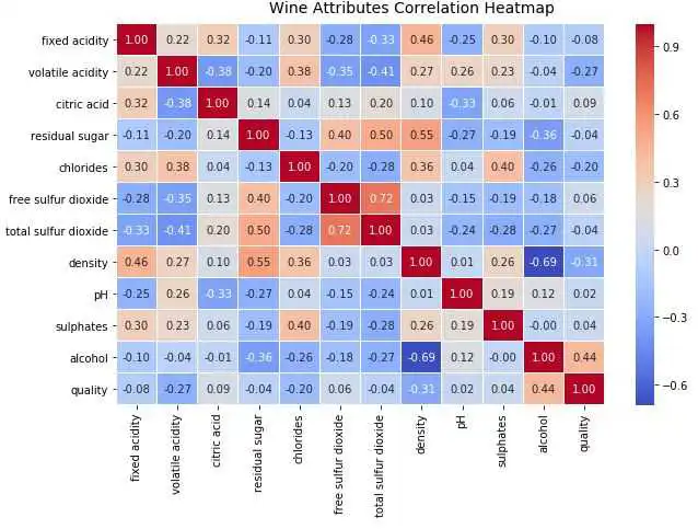

    # Correlation Matrix Heatmap


f, ax = plt.subplots(figsize=( 10, 6))
corr = wines.corr()
hm = sns.heatmap(round(corr, 2), annot= True, ax=ax, cmap= "coolwarm",fmt= '.2f',
 linewidths= .05)
f.subplots_adjust(top= 0.93)
t= f.suptitle( 'Wine Attributes Correlation Heatmap', fontsize= 14)

    # Correlation Matrix Heatmap


f, ax = plt.subplots(figsize=( 10, 6))
corr = wines.corr()
hm = sns.heatmap(round(corr, 2), annot= True, ax=ax, cmap= "coolwarm",fmt= '.2f',
 linewidths= .05)
f.subplots_adjust(top= 0.93)
t= f.suptitle( 'Wine Attributes Correlation Heatmap', fontsize= 14)
    # Scatter Plot


plt.scatter(wines[ 'sulphates'], wines[ 'alcohol'],
 alpha= 0.4, edgecolors= 'w')

plt.xlabel( 'Sulphates')
plt.ylabel( 'Alcohol')
plt.title( 'Wine Sulphates - Alcohol Content',y= 1.05)


 # Joint Plot
jp = sns.jointplot(x= 'sulphates', y= 'alcohol', data=wines,
 kind= 'reg', space= 0, size= 5, ratio= 4)
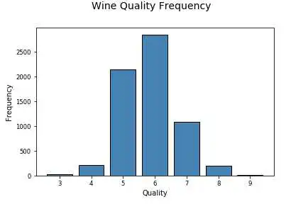
    # Using subplots or facets along with Bar Plots


fig = plt.figure(figsize = ( 10, 4))
title = fig.suptitle( "Wine Type - Quality", fontsize= 14)
fig.subplots_adjust(top= 0.85, wspace= 0.3)
 # red wine - wine quality
ax1 = fig.add_subplot( 1, 2, 1)
ax1.set_title( "Red Wine")
ax1.set_xlabel( "Quality")
ax1.set_ylabel( "Frequency")
rw_q = red_wine[ 'quality'].value_counts()
rw_q = (list(rw_q.index), list(rw_q.values))
ax1.set_ylim([ 0, 2500])
ax1.tick_params(axis= 'both', which= 'major', labelsize= 8.5)
bar1 = ax1.bar(rw_q[ 0], rw_q[ 1], color= 'red',
 edgecolor= 'black', linewidth= 1)

 # white wine - wine quality
ax2 = fig.add_subplot( 1, 2, 2)
ax2.set_title( "White Wine")
ax2.set_xlabel( "Quality")
ax2.set_ylabel( "Frequency")
ww_q = white_wine[ 'quality'].value_counts()
ww_q = (list(ww_q.index), list(ww_q.values))
ax2.set_ylim([ 0, 2500])
ax2.tick_params(axis= 'both', which= 'major', labelsize= 8.5)
bar2 = ax2.bar(ww_q[ 0], ww_q[ 1], color= 'white',
 edgecolor= 'black', linewidth= 1)
    # Multi-bar Plot


cp = sns.countplot(x= "quality", hue= "wine_type", data=wines,
 palette={ "red": "#FF9999", "white": "#FFE888"})
    # facets with histograms


fig = plt.figure(figsize = ( 10, 4))
title = fig.suptitle( "Sulphates Content in Wine", fontsize= 14)
fig.subplots_adjust(top= 0.85, wspace= 0.3)

ax1 = fig.add_subplot( 1, 2, 1)
ax1.set_title( "Red Wine")
ax1.set_xlabel( "Sulphates")
ax1.set_ylabel( "Frequency")
ax1.set_ylim([ 0, 1200])
ax1.text( 1.2, 800, r'$\mu$='+str(round(red_wine[ 'sulphates'].mean(), 2)),
 fontsize= 12)
r_freq, r_bins, r_patches = ax1.hist(red_wine[ 'sulphates'], color= 'red', bins= 15,
 edgecolor= 'black', linewidth= 1)

ax2 = fig.add_subplot( 1, 2, 2)
ax2.set_title( "White Wine")
ax2.set_xlabel( "Sulphates")
ax2.set_ylabel( "Frequency")
ax2.set_ylim([ 0, 1200])
ax2.text( 0.8, 800, r'$\mu$='+str(round(white_wine[ 'sulphates'].mean(), 2)),
 fontsize= 12)
w_freq, w_bins, w_patches = ax2.hist(white_wine[ 'sulphates'], color= 'white', bins= 15,
 edgecolor= 'black', linewidth= 1)


 # facets with density plots
fig = plt.figure(figsize = ( 10, 4))
title = fig.suptitle( "Sulphates Content in Wine", fontsize= 14)
fig.subplots_adjust(top= 0.85, wspace= 0.3)

ax1 = fig.add_subplot( 1, 2, 1)
ax1.set_title( "Red Wine")
ax1.set_xlabel( "Sulphates")
ax1.set_ylabel( "Density")
sns.kdeplot(red_wine[ 'sulphates'], ax=ax1, shade= True, color= 'r')

ax2 = fig.add_subplot( 1, 2, 2)
ax2.set_title( "White Wine")
ax2.set_xlabel( "Sulphates")
ax2.set_ylabel( "Density")
sns.kdeplot(white_wine[ 'sulphates'], ax=ax2, shade= True, color= 'y')
    # Using multiple Histograms


fig = plt.figure(figsize = ( 6, 4))
title = fig.suptitle( "Sulphates Content in Wine", fontsize= 14)
fig.subplots_adjust(top= 0.85, wspace= 0.3)
ax = fig.add_subplot( 1, 1, 1)
ax.set_xlabel( "Sulphates")
ax.set_ylabel( "Frequency")

g = sns.FacetGrid(wines, hue= 'wine_type', palette={ "red": "r", "white": "y"})
g.map(sns.distplot, 'sulphates', kde= False, bins= 15, ax=ax)
ax.legend(title= 'Wine Type')
plt.close( 2)
    # Box Plots


f, (ax) = plt.subplots( 1, 1, figsize=( 12, 4))
f.suptitle( 'Wine Quality - Alcohol Content', fontsize= 14)

sns.boxplot(x= "quality", y= "alcohol", data=wines, ax=ax)
ax.set_xlabel( "Wine Quality",size = 12,alpha= 0.8)
ax.set_ylabel( "Wine Alcohol %",size = 12,alpha= 0.8)
    # Violin Plots


f, (ax) = plt.subplots( 1, 1, figsize=( 12, 4))
f.suptitle( 'Wine Quality - Sulphates Content', fontsize= 14)

sns.violinplot(x= "quality", y= "sulphates", data=wines, ax=ax)
ax.set_xlabel( "Wine Quality",size = 12,alpha= 0.8)
ax.set_ylabel( "Wine Sulphates",size = 12,alpha= 0.8)
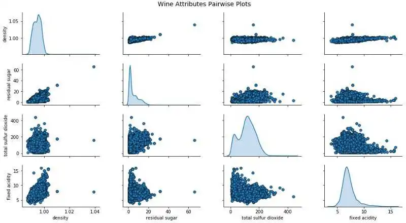
    # Scatter Plot with Hue for visualizing data in 3-D


cols = [ 'density', 'residual sugar', 'total sulfur dioxide', 'fixed acidity', 'wine_type']
pp = sns.pairplot(wines[cols], hue= 'wine_type', size= 1.8, aspect= 1.8,
 palette={ "red": "#FF9999", "white": "#FFE888"},
 plot_kws=dict(edgecolor= "black", linewidth= 0.5))
fig = pp.fig
fig.subplots_adjust(top= 0.93, wspace= 0.3)
t = fig.suptitle( 'Wine Attributes Pairwise Plots', fontsize= 14)
    # Visualizing 3-D numeric data with Scatter Plots


 # length, breadth and depth
fig = plt.figure(figsize=( 8, 6))
ax = fig.add_subplot( 111, projection= '3d')

xs = wines[ 'residual sugar']
ys = wines[ 'fixed acidity']
zs = wines[ 'alcohol']
ax.scatter(xs, ys, zs, s= 50, alpha= 0.6, edgecolors= 'w')

ax.set_xlabel( 'Residual Sugar')
ax.set_ylabel( 'Fixed Acidity')
ax.set_zlabel( 'Alcohol')
    # Visualizing 3-D numeric data with a bubble chart


 # length, breadth and size
plt.scatter(wines[ 'fixed acidity'], wines[ 'alcohol'], s=wines[ 'residual sugar']* 25,
 alpha= 0.4, edgecolors= 'w')

plt.xlabel( 'Fixed Acidity')
plt.ylabel( 'Alcohol')
plt.title( 'Wine Alcohol Content - Fixed Acidity - Residual Sugar',y= 1.05)
    # Visualizing 3-D categorical data using bar plots


 # leveraging the concepts of hue and facets
fc = sns.factorplot(x= "quality", hue= "wine_type", col= "quality_label",
 data=wines, kind= "count",
 palette={ "red": "#FF9999", "white": "#FFE888"})
    # Visualizing 3-D mix data using scatter plots


 # leveraging the concepts of hue for categorical dimension
jp = sns.pairplot(wines, x_vars=[ "sulphates"], y_vars=[ "alcohol"], size= 4.5,
 hue= "wine_type", palette={ "red": "#FF9999", "white": "#FFE888"},
 plot_kws=dict(edgecolor= "k", linewidth= 0.5))

 # we can also view relationships\correlations as needed
lp = sns.lmplot(x= 'sulphates', y= 'alcohol', hue= 'wine_type',
 palette={ "red": "#FF9999", "white": "#FFE888"},
 data=wines, fit_reg= True, legend= True,
 scatter_kws=dict(edgecolor= "k", linewidth= 0.5))
    # Visualizing 3-D mix data using kernel density plots


 # leveraging the concepts of hue for categorical dimension
ax = sns.kdeplot(white_wine[ 'sulphates'], white_wine[ 'alcohol'],
 cmap= "YlOrBr", shade= True, shade_lowest= False)
ax = sns.kdeplot(red_wine[ 'sulphates'], red_wine[ 'alcohol'],
 cmap= "Reds", shade= True, shade_lowest= False)
    # Visualizing 3-D mix data using violin plots


 # leveraging the concepts of hue and axes for > 1 categorical dimensions
f, (ax1, ax2) = plt.subplots( 1, 2, figsize=( 14, 4))
f.suptitle( 'Wine Type - Quality - Acidity', fontsize= 14)

sns.violinplot(x= "quality", y= "volatile acidity",
 data=wines, inner= "quart", linewidth= 1.3,ax=ax1)
ax1.set_xlabel( "Wine Quality",size = 12,alpha= 0.8)
ax1.set_ylabel( "Wine Volatile Acidity",size = 12,alpha= 0.8)

sns.violinplot(x= "quality", y= "volatile acidity", hue= "wine_type",
 data=wines, split= True, inner= "quart", linewidth= 1.3,
 palette={ "red": "#FF9999", "white": "white"}, ax=ax2)
ax2.set_xlabel( "Wine Quality",size = 12,alpha= 0.8)
ax2.set_ylabel( "Wine Volatile Acidity",size = 12,alpha= 0.8)
l = plt.legend(loc= 'upper right', title= 'Wine Type')
    # Visualizing 3-D mix data using box plots


 # leveraging the concepts of hue and axes for > 1 categorical dimensions
f, (ax1, ax2) = plt.subplots( 1, 2, figsize=( 14, 4))
f.suptitle( 'Wine Type - Quality - Alcohol Content', fontsize= 14)

sns.boxplot(x= "quality", y= "alcohol", hue= "wine_type",
 data=wines, palette={ "red": "#FF9999", "white": "white"}, ax=ax1)
ax1.set_xlabel( "Wine Quality",size = 12,alpha= 0.8)
ax1.set_ylabel( "Wine Alcohol %",size = 12,alpha= 0.8)

sns.boxplot(x= "quality_label", y= "alcohol", hue= "wine_type",
 data=wines, palette={ "red": "#FF9999", "white": "white"}, ax=ax2)
ax2.set_xlabel( "Wine Quality Class",size = 12,alpha= 0.8)
ax2.set_ylabel( "Wine Alcohol %",size = 12,alpha= 0.8)
l = plt.legend(loc= 'best', title= 'Wine Type')
    # Visualizing 4-D mix data using scatter plots


 # leveraging the concepts of hue and depth
fig = plt.figure(figsize=( 8, 6))
t = fig.suptitle( 'Wine Residual Sugar - Alcohol Content - Acidity - Type', fontsize= 14)
ax = fig.add_subplot( 111, projection= '3d')

xs = list(wines[ 'residual sugar'])
ys = list(wines[ 'alcohol'])
zs = list(wines[ 'fixed acidity'])
data_points = [(x, y, z) for x, y, z in zip(xs, ys, zs)]
colors = [ 'red' if wt == 'red' else 'yellow' for wt in list(wines[ 'wine_type'])]

 for data, color in zip(data_points, colors):
 x, y, z = data
 ax.scatter(x, y, z, alpha= 0.4, c=color, edgecolors= 'none', s= 30)

ax.set_xlabel( 'Residual Sugar')
ax.set_ylabel( 'Alcohol')
ax.set_zlabel( 'Fixed Acidity')
    # Visualizing 4-D mix data using bubble plots


 # leveraging the concepts of hue and size
size = wines[ 'residual sugar']* 25
fill_colors = [ '#FF9999' if wt== 'red' else '#FFE888' for wt in list(wines[ 'wine_type'])]
edge_colors = [ 'red' if wt== 'red' else 'orange' for wt in list(wines[ 'wine_type'])]

plt.scatter(wines[ 'fixed acidity'], wines[ 'alcohol'], s=size,
 alpha= 0.4, color=fill_colors, edgecolors=edge_colors)

plt.xlabel( 'Fixed Acidity')
plt.ylabel( 'Alcohol')
plt.title( 'Wine Alcohol Content - Fixed Acidity - Residual Sugar - Type',y= 1.05)
    # Visualizing 4-D mix data using scatter plots


 # leveraging the concepts of hue and facets for > 1 categorical attributes
g = sns.FacetGrid(wines, col= "wine_type", hue= 'quality_label',
 col_order=[ 'red', 'white'], hue_order=[ 'low', 'medium', 'high'],
 aspect= 1.2, size= 3.5, palette=sns.light_palette( 'navy', 4)[ 1:])
g.map(plt.scatter, "volatile acidity", "alcohol", alpha= 0.9,
 edgecolor= 'white', linewidth= 0.5, s= 100)
fig = g.fig
fig.subplots_adjust(top= 0.8, wspace= 0.3)
fig.suptitle( 'Wine Type - Alcohol - Quality - Acidity', fontsize= 14)
l = g.add_legend(title= 'Wine Quality Class')
    # Visualizing 5-D mix data using bubble charts


 # leveraging the concepts of hue, size and depth
fig = plt.figure(figsize=( 8, 6))
ax = fig.add_subplot( 111, projection= '3d')
t = fig.suptitle( 'Wine Residual Sugar - Alcohol Content - Acidity - Total Sulfur Dioxide - Type', fontsize= 14)

xs = list(wines[ 'residual sugar'])
ys = list(wines[ 'alcohol'])
zs = list(wines[ 'fixed acidity'])
data_points = [(x, y, z) for x, y, z in zip(xs, ys, zs)]

ss = list(wines[ 'total sulfur dioxide'])
colors = [ 'red' if wt == 'red' else 'yellow' for wt in list(wines[ 'wine_type'])]

 for data, color, size in zip(data_points, colors, ss):
 x, y, z = data
 ax.scatter(x, y, z, alpha= 0.4, c=color, edgecolors= 'none', s=size)

ax.set_xlabel( 'Residual Sugar')
ax.set_ylabel( 'Alcohol')
ax.set_zlabel( 'Fixed Acidity')
    # Visualizing 6-D mix data using scatter charts


 # leveraging the concepts of hue, size, depth and shape
fig = plt.figure(figsize=( 8, 6))
t = fig.suptitle( 'Wine Residual Sugar - Alcohol Content - Acidity - Total Sulfur Dioxide - Type - Quality', fontsize= 14)
ax = fig.add_subplot( 111, projection= '3d')

xs = list(wines[ 'residual sugar'])
ys = list(wines[ 'alcohol'])
zs = list(wines[ 'fixed acidity'])
data_points = [(x, y, z) for x, y, z in zip(xs, ys, zs)]

ss = list(wines[ 'total sulfur dioxide'])
colors = [ 'red' if wt == 'red' else 'yellow' for wt in list(wines[ 'wine_type'])]
markers = [ ',' if q == 'high' else 'x' if q == 'medium' else 'o' for q in list(wines[ 'quality_label'])]

 for data, color, size, mark in zip(data_points, colors, ss, markers):
 x, y, z = data
 ax.scatter(x, y, z, alpha= 0.4, c=color, edgecolors= 'none', s=size, marker=mark)

ax.set_xlabel( 'Residual Sugar')
ax.set_ylabel( 'Alcohol')
ax.set_zlabel( 'Fixed Acidity')
- 结合形状和 y 轴的表现,我们知道高中档的葡萄酒的酒精含量比低质葡萄酒更高。
- 结合色调和大小的表现,我们知道白葡萄酒的总二氧化硫含量比红葡萄酒更高。
- 结合深度和色调的表现,我们知道白葡萄酒的酸度比红葡萄酒更低。
- 结合色调和 x 轴的表现,我们知道红葡萄酒的残糖比白葡萄酒更低。
- 结合色调和形状的表现,似乎白葡萄酒的高品质产量高于红葡萄酒。(可能是由于白葡萄酒的样本量较大)
我们也可以用分面属性来代替深度构建 6 维数据可视化效果。
    # Visualizing 6-D mix data using scatter charts


 # leveraging the concepts of hue, facets and size
 g = sns.FacetGrid(wines, row= 'wine_type', col= "quality", hue= 'quality_label', size= 4)
 g.map(plt.scatter, "residual sugar", "alcohol", alpha= 0.5,
 edgecolor= 'k', linewidth= 0.5, s=wines[ 'total sulfur dioxide']* 2)
 fig = g.fig
 fig.set_size_inches( 18, 8)
 fig.subplots_adjust(top= 0.85, wspace= 0.3)
 fig.suptitle( 'Wine Type - Sulfur Dioxide - Residual Sugar - Alcohol - Quality Class - Quality Rating', fontsize= 14)
 l = g.add_legend(title= 'Wine Quality Class')
··· END ···
关于Python数据可视化的内容,可以点击下方书籍,了解更多
版权声明:
本文来自互联网用户投稿,该文观点仅代表作者本人,不代表本站立场。本站仅提供信息存储空间服务,不拥有所有权,不承担相关法律责任。
如若内容造成侵权、违法违规、事实不符,请将相关资料发送至xkadmin@xkablog.com进行投诉反馈,一经查实,立即处理!
转载请注明出处,原文链接:https://www.xkablog.com/kjbd-gc/25704.html